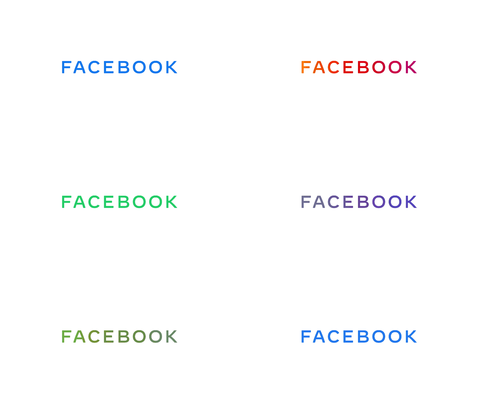
Facebook is back in the news again, but this time with a rebranded logo. According to the announcement, the company has taken this step to distinguish the various products it offers (including big names like WhatsApp and Instagram), as well as the Facebook app, from the parent company Facebook.
While talking about the new company logo, Facebook’s Chief Marketing Officer, Antonio Lucio, said:
“People should know which companies make the products they use. Our main services include the Facebook app, Messenger, Instagram, WhatsApp, Oculus, Workplace, Portal, and Calibra. These apps and technologies have shared infrastructure for years, and the teams behind them frequently work together. We started being clearer about the products and services that are part of Facebook years ago, adding a company endorsement to products like Oculus, Workplace, and Portal. And in June, we began including “from Facebook” within all our apps. Over the coming weeks, we will start using the new brand within our products and marketing materials, including a new company website.”
The idea behind redesigning the logo was aimed at bringing more clarity and transparency when referring to ‘Facebook the social media app,’ ‘Facebook the company,’ and the various other products owned by it. The new logo adopts colors from the logos of these products to reflect the different apps owned by Facebook – blue for the Facebook app, Green for WhatsApp, and pinkish golden for Instagram.

The company’s realization behind such a rebranded logo arrives at a time when so many different websites and apps exist already, and Facebook probably did not want its distinct identity to get lost or become vague in such a scenario. Thus, coming up with a new logo is not just meant to represent Facebook as an umbrella brand for its various products, but it will also help in establishing the company’s unique identity amidst other brands.
Also read: How to enable Dark Mode in Facebook Messenger for iOS and Android
Facebook’s representatives, Zach Stubenvoll, Sam Halle, Andrew Stirk, and Luke Woods, have pointed out three design behaviors that went into the rebranding process of the new logo:
- Clarity: a brand that simplifies and builds understanding
- Empathy: a system that is respectful of context and environment
- Creating Space: design that supports people and their stories
In order to further bring more clarity in the design mechanism, the Facebook wordmark was altered so that people could form the right association when they saw the word ‘Facebook,’ (not just linking it to the Facebook app but the Facebook company on the whole, as well as the products offered by it). Henceforth, the new rebranded logo was customized in terms of typography and capitalization of words, in order to form a clear visual differentiation between Facebook, the company, and Facebook, the app.

Also, the word mark occupies a wider space and has larger letterforms, and they both represent Facebook as the bigger brand/company under which its product portfolio exists. The color system used in the logo further corresponds to the different products owned by the company and has been carefully incorporated to develop vivid and correct associations in the minds of people who view Facebook from now on. The company will also be getting its new website for corporate identity.

Facebook clearly has a lot in mind regarding its new design mechanism, but whether or not it will be able to convince people to form the right associations related to its Facebook app and the other products cannot be predicted at the moment.


Share Your Thoughts